
Monday, June 20, 2011
Final Exam!
Thursday, May 12, 2011
Final Fantasy Poster!

So here it is! My final fantasy poster. I didn't change much from the original one that I posted, but I made a few changes. First I darkened the moon a bit with the burn tool to make it blend in with the dark clouds more. Then I wanted the lightning to "pop", so I highlighted the white lighting with yellow. I used serval images to complete this poster.
I used this image for the background: 
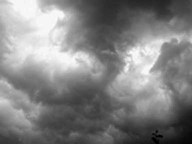
I used this image for the sky:
I used this image for the eagle body:

I used this image for the dragon head:

And I used this image for the moon:

To make the lightning, I just used the paint tool and drew it on with white paint. But then I highlighted it with yellow paint to make it stand out more. I used the tutorial: http://psd.tutsplus.com/tutorials/photo-effects-tutorials/how-to-place-a-fantasy-creature-in-a-misty-landscape/ to make the eagle/dragon. And I also used the tutorial: http://www.alfoart.com/mysterious_lightning_1.html to make the sky, lightning and moon.
Thursday, May 5, 2011
Fantasy Poster

Heres my fantasy poster so far. I still have another week to work on it, so I'm not quite done yet. I got ideas for this poster from the two tutorials: http://www.alfoart.com/mysterious_lightning_1.html and http://psd.tutsplus.com/tutorials/photo-effects-tutorials/how-to-place-a-fantasy-creature-in-a-misty-landscape/. The first tutorial helped me make the lightning and the sky. The second tutorial helped me make the eagle/ dragon. I think there's something missing from it, so if you have any suggestions please comment below! Thanks :]
Thursday, April 14, 2011
Art Deco Poster

I used this picture as my background:

I also used this image for the hula dancer:

Then I used several pictures of flowers to put them behind the word "Hawaii."
I used this tutorial: http://veerle-v2.duoh.com/blog/comments/photoshop_vintage_effect/ for the background and the hula dancer to make the colors brighter and to make it pop. I made the whole poster using photoshop.
Wednesday, March 16, 2011
New & Improved color theory video!
Heres my new, edited color theory video! The sources are the same as the old video. I just fixed my images to make it look neater. Enjoy!
Thursday, March 10, 2011
Tuesday, February 15, 2011
Three logo designs
 |
| Click to enlarge |
 |
| Click to enlarge |
Subscribe to:
Comments (Atom)